Original Characters Are Becoming Micro-Brands — The Workflow I Use to Turn an OC Into a Real Asset
Learn how creators turn original characters into consistent brand assets using a practical workflow, AI tools, and Live2D-style motion for scalable content.
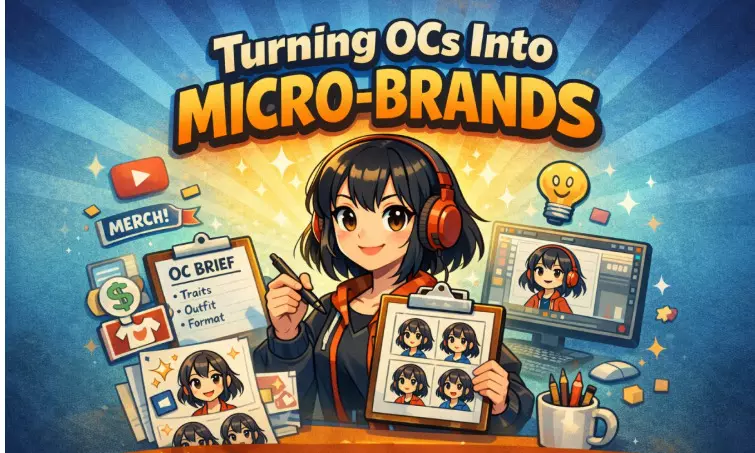
A creator-designed original character used as a consistent brand identity across thumbnails, social media content, and animated Live2D-style formats.

I’ve noticed something in the last year: original characters aren’t living only in sketchbooks anymore. They’re showing up as channel mascots, storefront avatars, recurring faces in comic strips, and “hosts” for short-form video series. And the reason isn’t just aesthetics—it’s practicality.
When you’re trying to grow an audience (or sell something) attention is expensive. Consistency is the part most creators underestimate. A good OC gives me both: a recognizable identity people can spot in half a second, and a flexible asset I can reuse across thumbnails, merch, reels, community posts, and even pitch decks. If I don’t want to show my face—or I simply want a stronger brand story—an OC becomes a business decision, not a vanity project.
I used to treat OC creation like a big “one day I’ll finish it” art goal. That approach killed momentum. What finally worked was treating the character like a product asset with clear requirements. Once I did that, the process got lighter, faster, and surprisingly fun.
I’ll walk through the workflow I use, what I watch out for, and why some characters blow up while others stay stuck as “pretty drawings.”
Why I care about consistency more than novelty
A one-off illustration can get likes. A consistent character builds recall. Recall is what brings repeat views, returning customers, and a sense of “I know this creator” even when the post is just a quick scroll-by.
Here’s what an OC does for me that a random post can’t:
It becomes a signature across platforms (Instagram, YouTube, a shop page, a newsletter header).
It carries a theme—comedy, comfort, sci-fi, fashion, education—without me reinventing the vibe every time.
It scales into formats like stickers, emotes, simple loops, and short recurring clips.
I also see why small businesses are adopting OCs. A café doesn’t need a mascot because it’s cute; it needs one because it’s repeatable. It’s a visual shortcut customers recognize instantly, even on a tiny screen.
The workflow I follow: concept → consistency → outputs
Most OC projects stall for one reason: the creator (me included) keeps “exploring” forever. Exploration feels productive, but it often hides indecision. So I keep a simple pipeline and force myself to move forward.
1) I draft a concise character brief, then I hold the line.
I’m not writing lore. I’m writing direction.
3–5 personality traits (calm, mischievous, blunt, soft, curious—whatever fits)
3 visual anchors I won’t change (hair silhouette, eye style, one key accessory)
where this character will live (thumbnails, a comic, reels, a brand mascot, etc.)
If I can’t describe the character clearly in a few lines, the design phase always gets messy later.
2) I build a “small, consistent set” before I do anything fancy
This step feels boring, but it saves me weeks.
1 hero portrait (the “official” face)
1 full-body reference (even if I rarely use it)
3 expressions (neutral, happy, surprised)
max 2 outfits at the start
Keeping it tight prevents the classic trap: I make ten “cool versions” and accidentally end up with ten different characters.
When I need an efficient way to explore and lock an OC direction, I’ll use AI OC Maker as a starting point for iteration and variation—especially when I’m trying to decide what reads best at thumbnail size.
3) I decide formats early, because formats decide everything
If the character is mainly for thumbnails, readability matters most. If it’s for motion, I care about clean shapes and stable facial features. If it’s for stickers, I simplify aggressively.
Once I choose formats, I stop designing “for everything” and start designing for what I’ll actually publish.
Where Live2D-style motion fits into my content
I used to think Live2D was mostly for streamers. Now I see it everywhere: reaction clips, talking-head explainers (without showing a real face), short news-style reels, and brand mascots that “host” content.
What I like about it is the subtlety. A little head sway, blinking, and mouth movement makes a character feel present, without needing a complicated 3D rig or heavy editing.
If I’m planning motion content, I treat the character like a performance asset, not a single illustration. For turning a strong static design into something that can move in a Live2D-style way, I’ll use AI image to live2D so I can test motion formats faster instead of letting animation become a “someday” project.
What I’m building
| Best output to focus on | What matters most | Mistake I avoid |
Brand identity (creator page / small business)
| 1–3 consistent portraits + simple pose set | recognizable silhouette, clean palette | over-detailing that dies on mobile |
Content series (reels / comics / memes)
| expressions + reusable scene assets | consistency, speed | changing the face shape every post |
Motion (loops / talking segments)
| Live2D-style animated outputs | stable face, clear eyes/mouth | using a source image with harsh shadows/filters |
Merch & community (stickers/emotes)
| simplified icons / chibi pack | strong outline, clear emotion | too much micro-detail that prints poorly |
Guardrails that keep me from wasting time
This is the part I wish someone had drilled into me earlier.
I keep one “master reference,” and I protect it.
When I find the look that feels right, I lock it. Every new asset gets compared to that reference. If something drifts, I fix it immediately. Drift compounds.
I test at thumbnail size, not full resolution.
A design can look amazing big and still fail as a profile picture. If the face becomes unreadable at small size, I simplify.
I treat my color palette like a brand asset.
I pick 3–5 core colors and reuse them. Even when the scene changes, the character still feels like “me.”
I don’t confuse variation with progress.
New outfits and alternate hairstyles feel like movement. Sometimes it’s just procrastination dressed up as creativity. I build the “main” character first, then expand.
The boring (but important) side: commercial clarity
If I’m going to monetize the character—ads, merch, client work, sponsored posts—I need basic clarity. I’m not trying to be dramatic, but I’ve seen creators get burned because they never wrote anything down.
I make sure I can answer:
- Can I use this character commercially?
- Can it appear in paid campaigns, packaging, or sponsored content?
- If multiple people contributed, who owns what?
I keep simple documentation: where the design came from, who made it, and what rights I have to publish and monetize it. If the OC becomes central to my brand, that paper trail becomes more valuable than people think.
The real takeaway I keep coming back to
A strong OC isn’t “one good drawing.” It’s a repeatable identity system: clear design anchors, consistent outputs, and a workflow that lets me produce new assets without reinventing the character every time.
That’s why OCs are turning into micro-brands. They let creators and small businesses stay recognizable without needing a full studio.
The question I ask myself is simple: if someone sees my character on a crowded feed, do they know it’s mine before they read the caption? If the answer is “almost,” I’m close. At that point, it’s not luck—it’s process.

